
FUKI Collective is a music branding agency focused on building universes and anticipation for album rollouts, single releases or events.
I founded FUKI when I was starting out to do photography commercially, when I saw an opportunity to centralise a musicians visual team and create truly concise branding work.
We care about playful concepts that show off our personality and sense of humour. These ideas are expressed through videos, photos and graphic design.

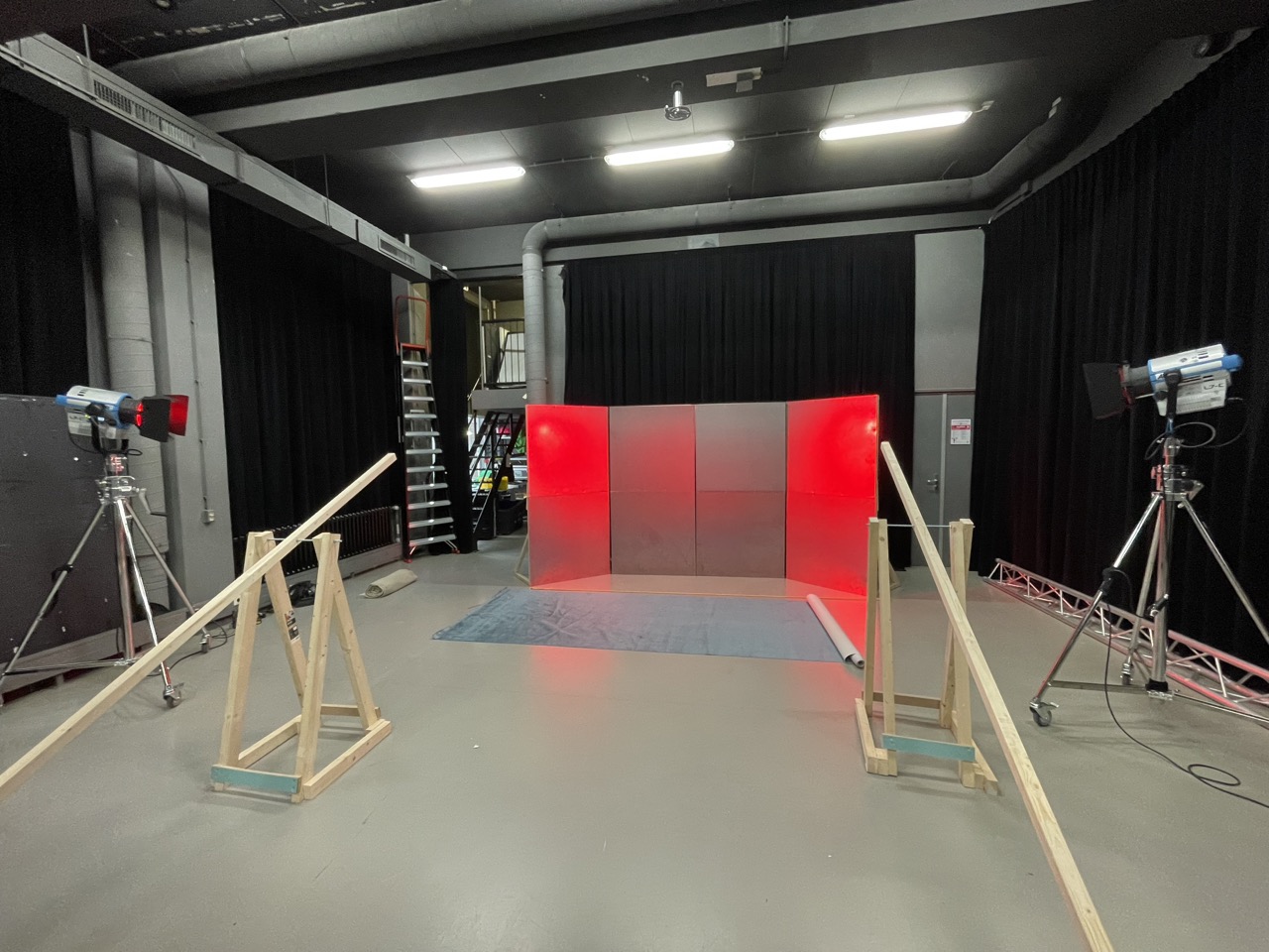
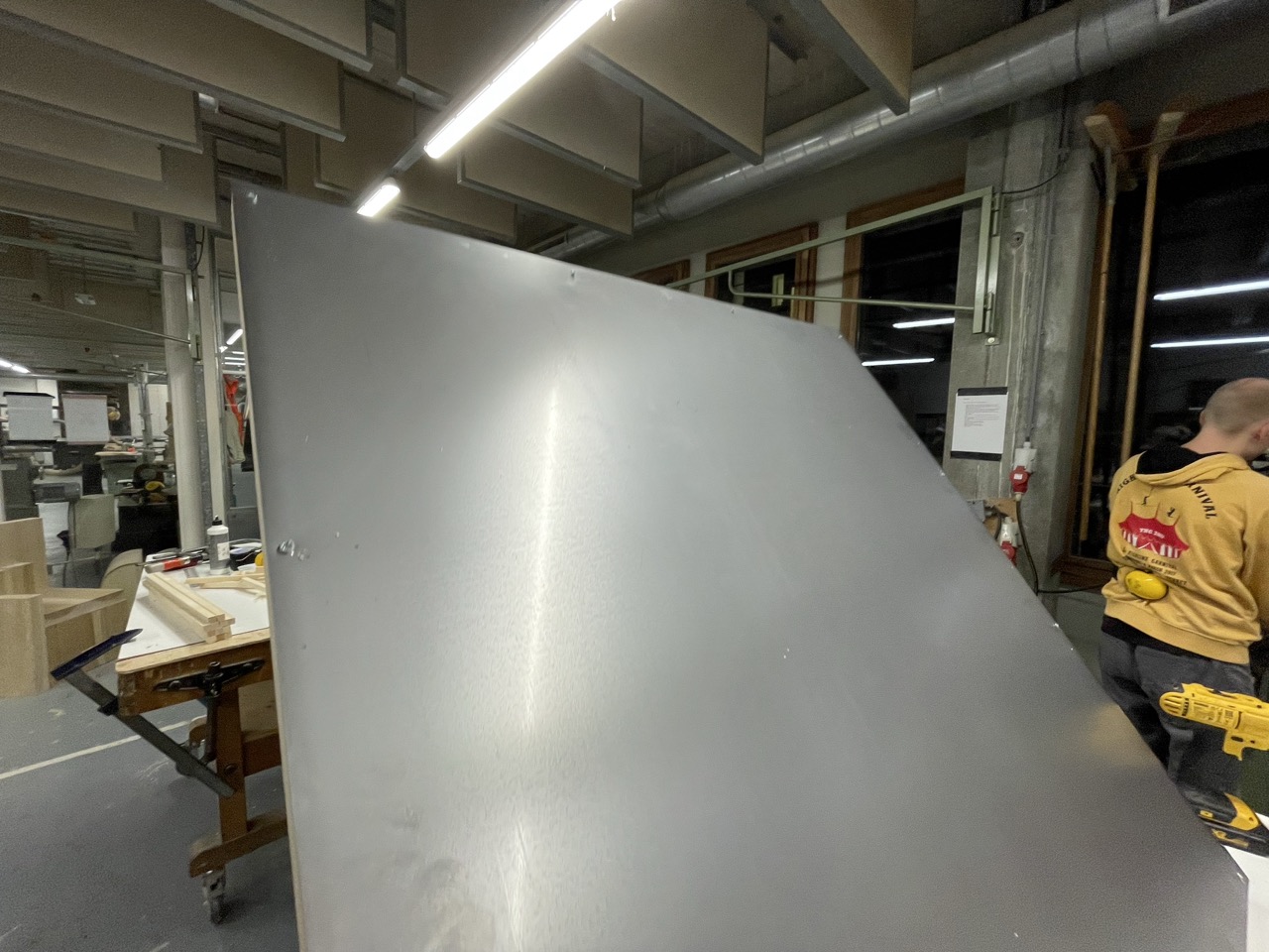
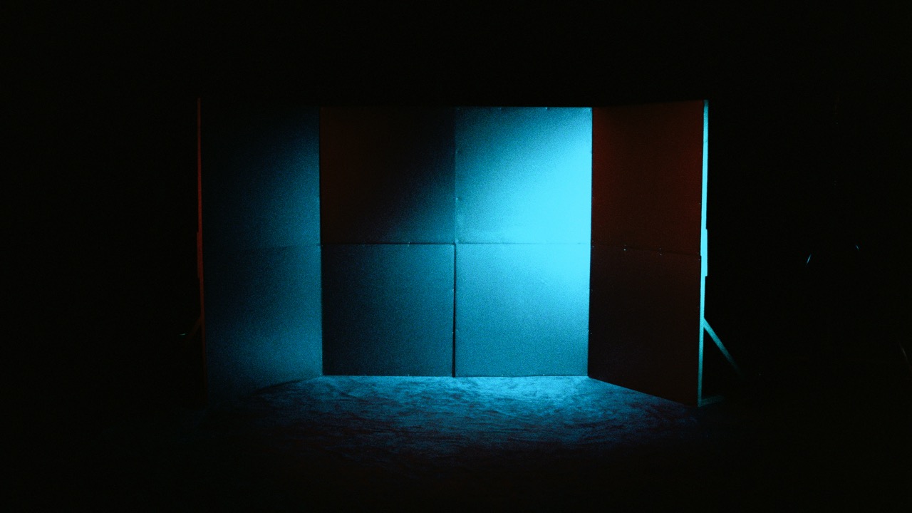
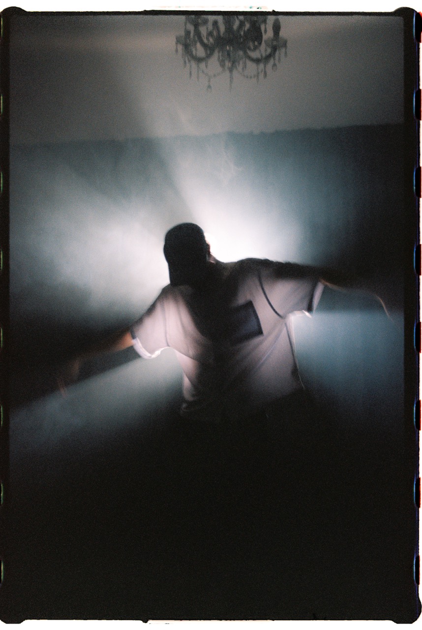
For the third edition of FUKI live I am building a stage. The stage consists of four metal walls, made from eight panels.I choose for metal because of its reflective property and the oxidation that will happen after a few weeks of storage. This fits perfect in our branding concept for the event.
Here are a few photos and videos showing the process from making and testing to the final form.
Building an universe for upcoming artist to perform in
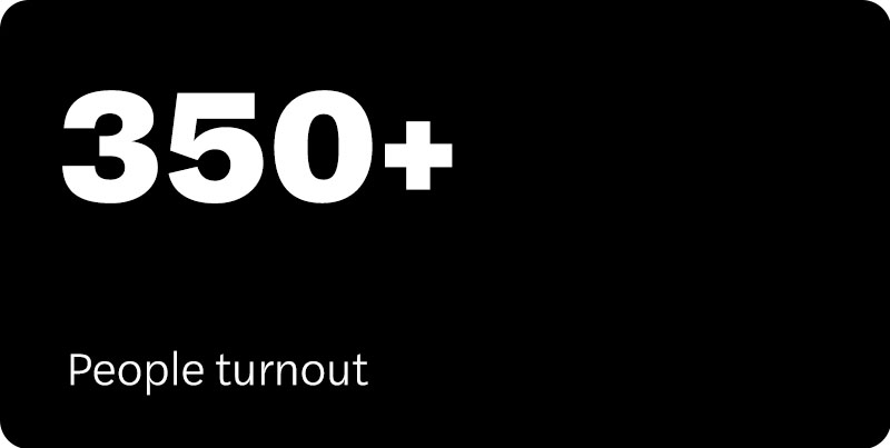
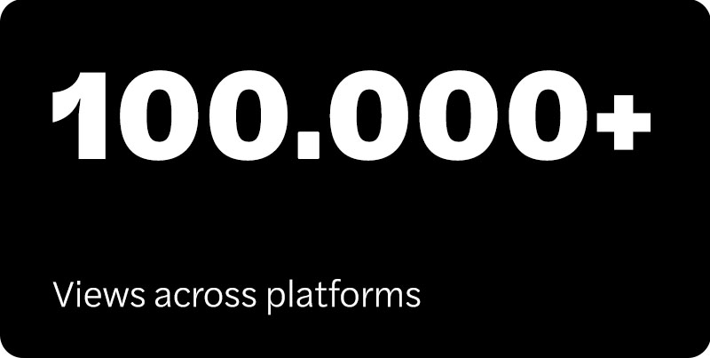
The FUKI live sessions is a concept where we invite acts to perform at our event and in return, they get aside from them getting to perform at our event which is meticulously created through concepting and has a strong visual identity which will bring them new fans. A unique fully registered performance video, short form content, press photos and concert photos.
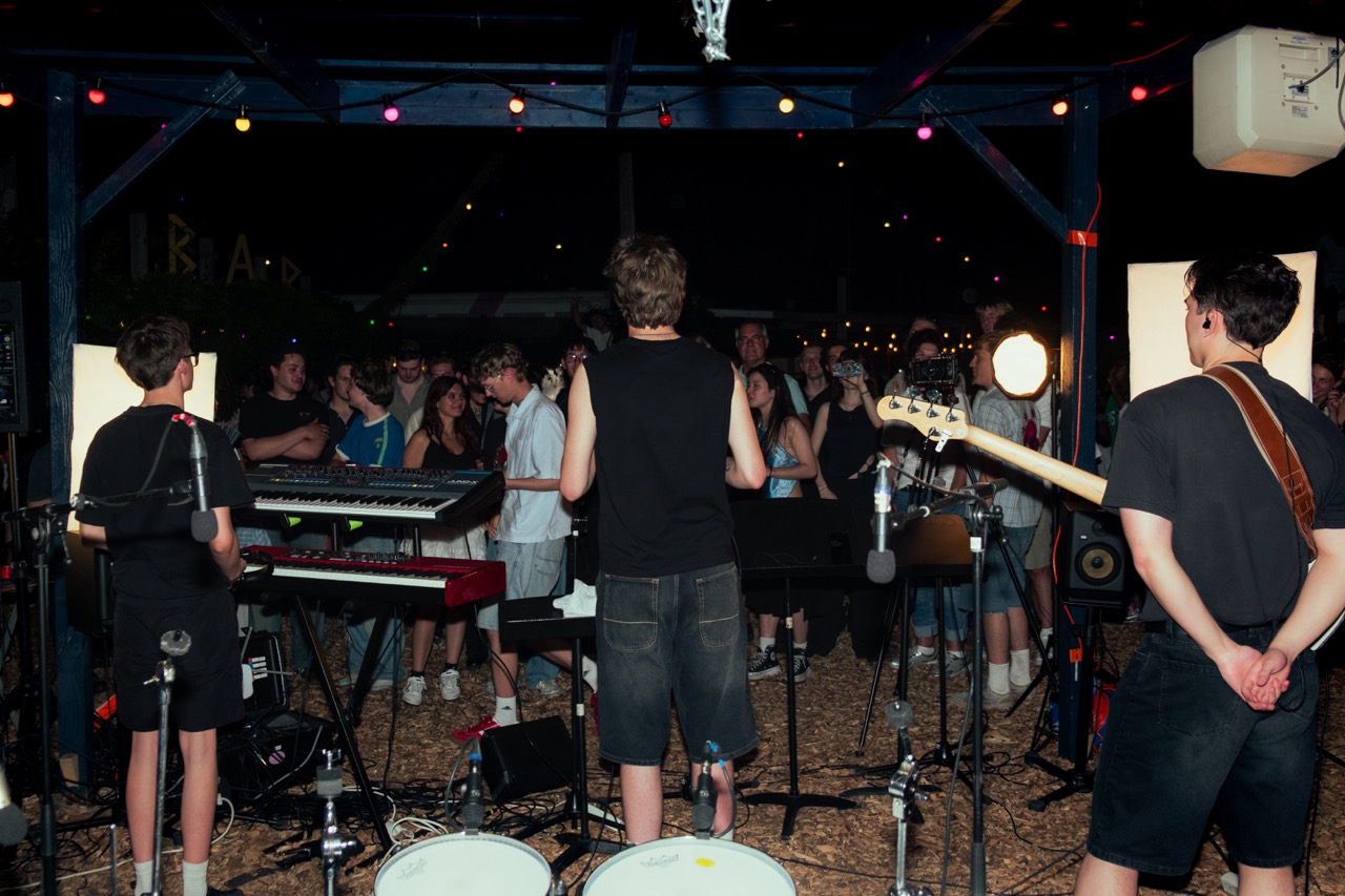
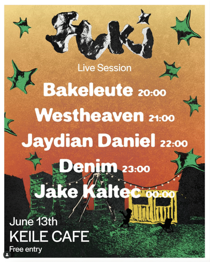
The concept for the live session was to show the beauty hidden in the cracks of the rough port area that the Keilewerf in Rotterdam west is and give upcoming musicians a stage where they could shine and give our community a live music experience they wouldn’t forget. This manifested itself in a visual identity that was rough and grimy around the edges then juxtaposed with a warm and invitingness coming closer. In looking for a venue, we immediately knew that Keilecafe, situated in the midst of the before described port area of the Keilewerf would be the perfect fit for our event. They were excited to be a part of this.
These are the performance registrations from our live session at Keile Cafe

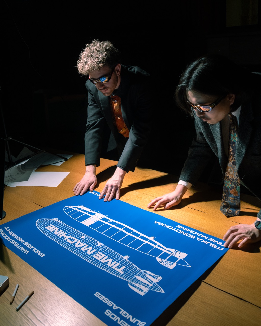
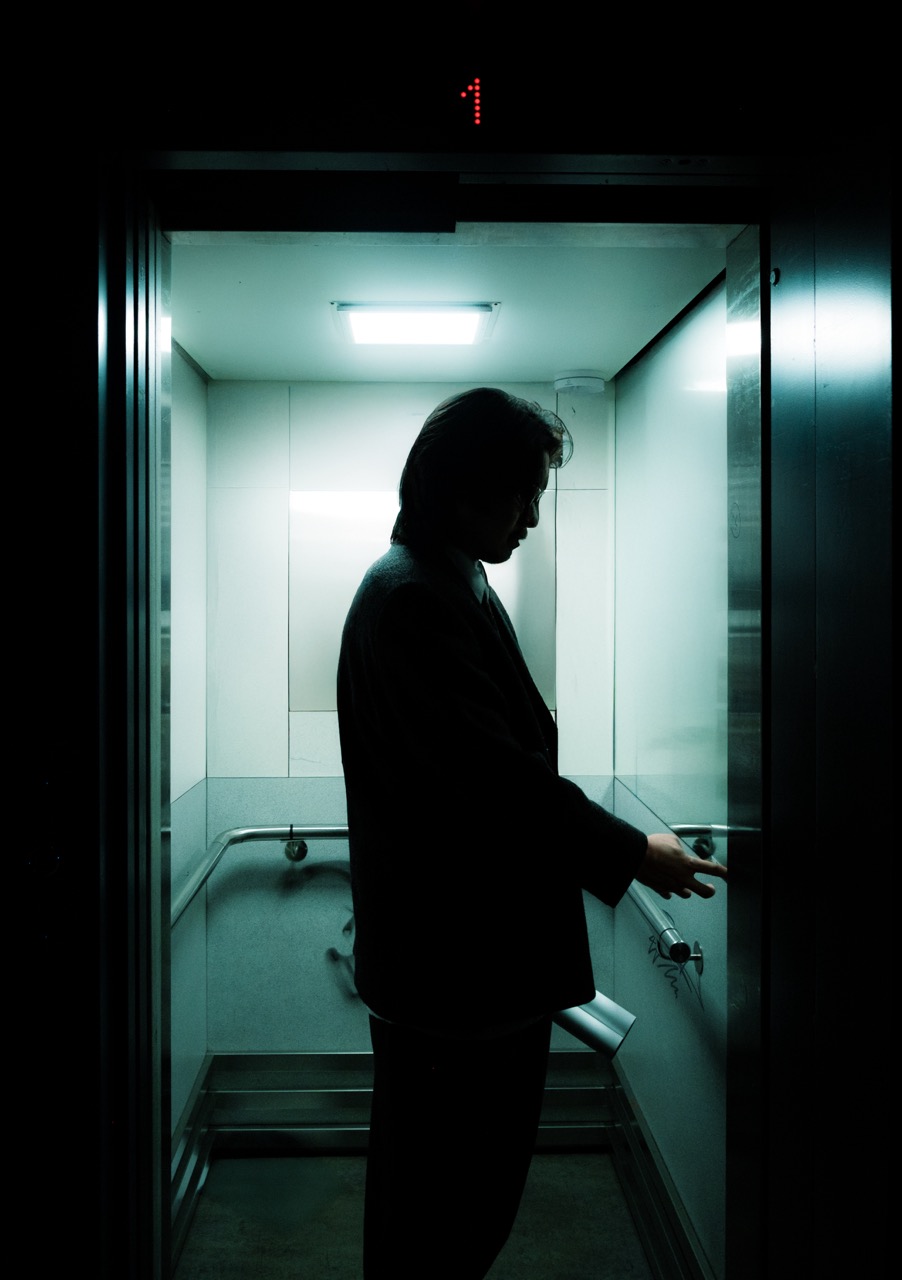
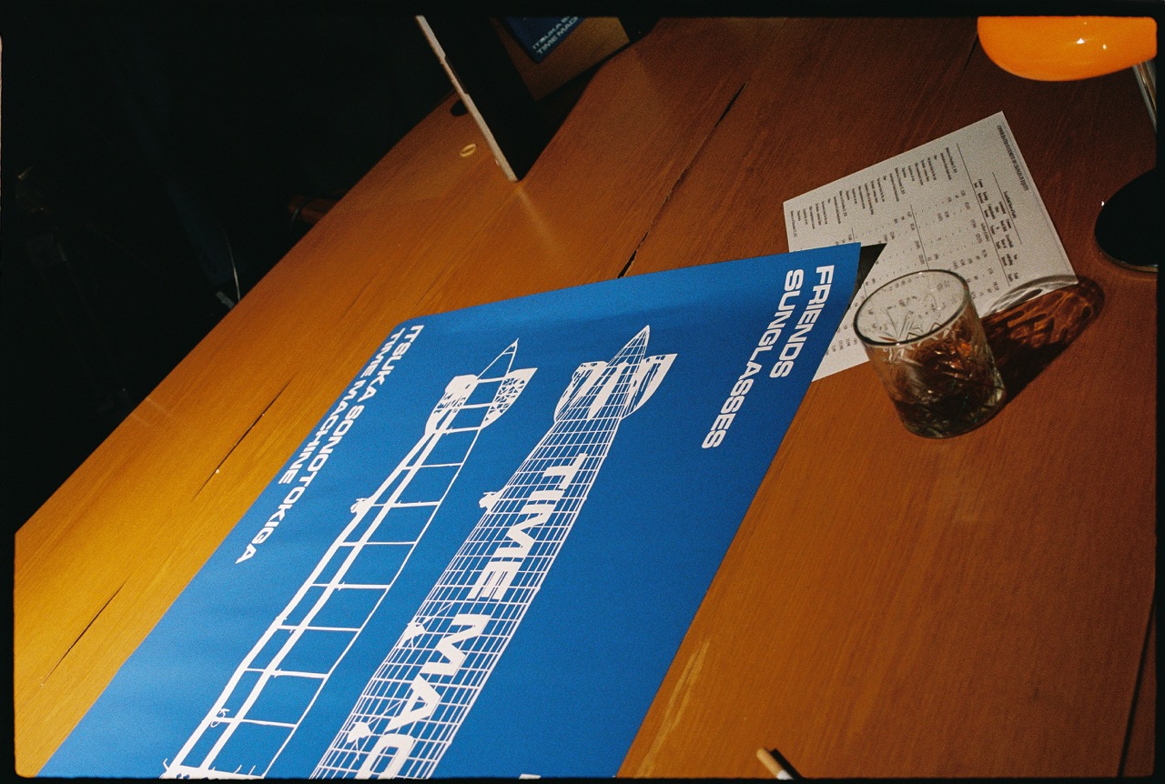
How we built a nostalgic world reminiscent of 90s Japanese City Pop, from scratch.
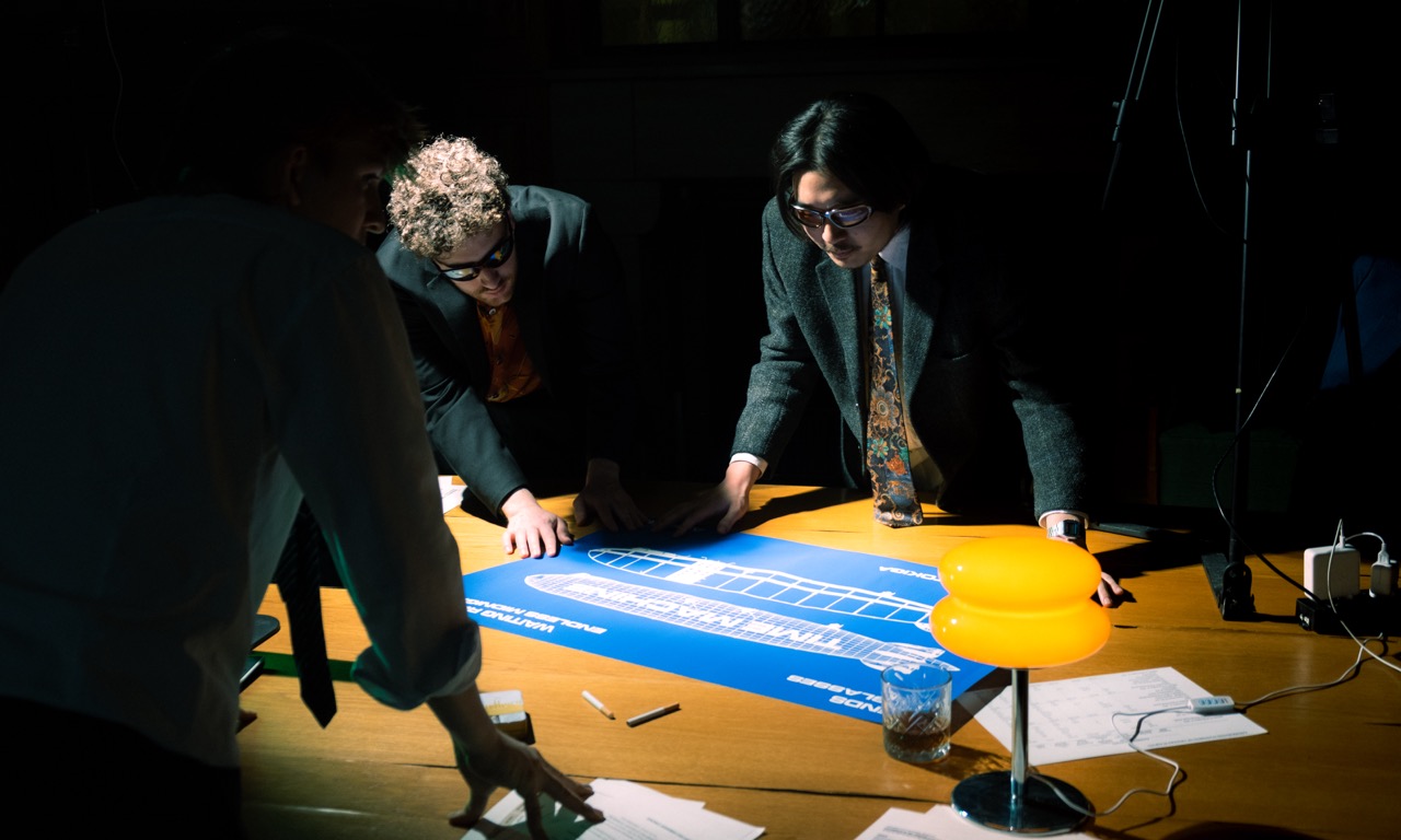
When we were asked to design their logo and brand identity, we dove deep into the world of City Pop. We didn’t just listen—we lived it. For weeks, it was the only thing we played, to see what feeling it sparked, and when we connected to it at most. We immersed ourselves in the textures, colours, and cultural energy of 90s Japan, letting the aesthetic shape every design decision we made. The result was a mix of nostalgic 90s tv aesthetics and graphics, mixed with contemporary styles.
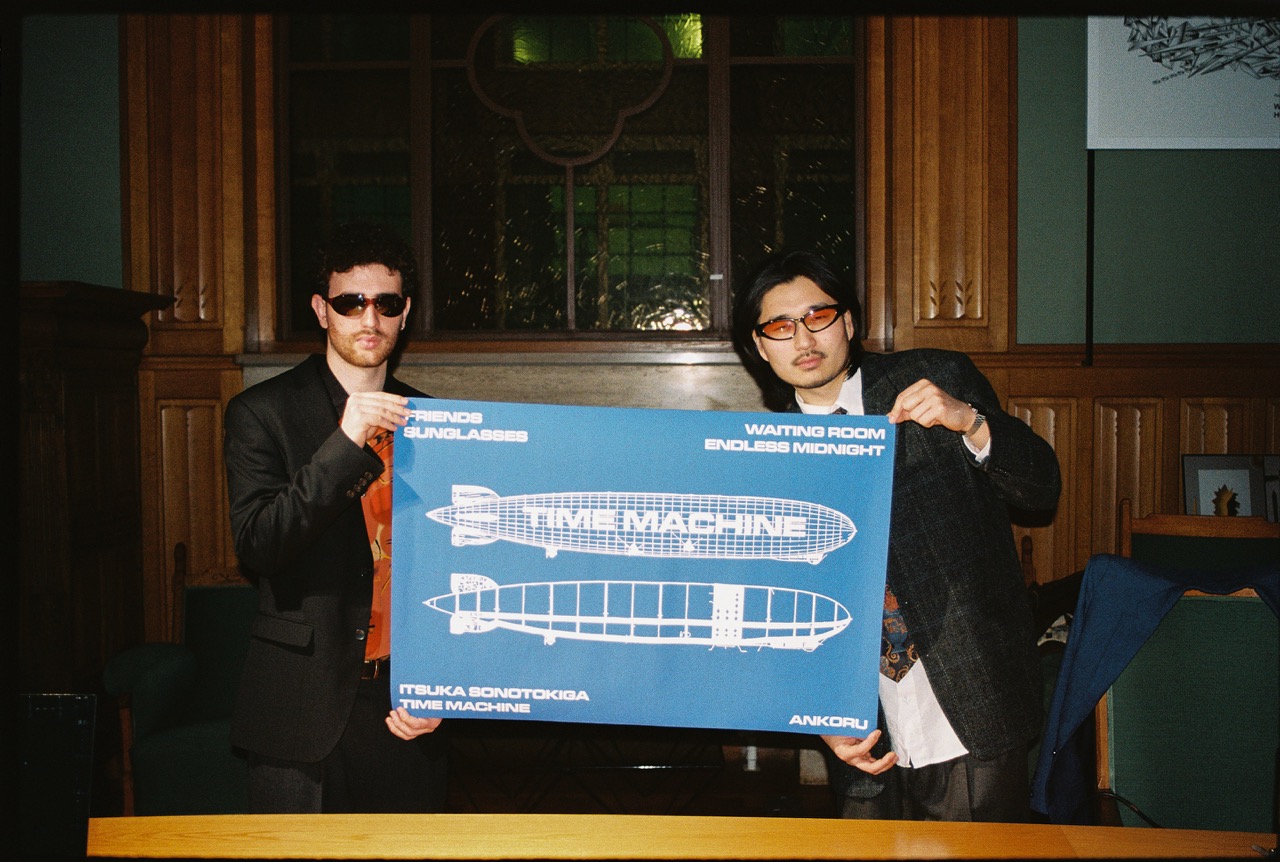
Here are a few of the pieces that we made around KAGAMI's EP rollout

For this music video I did direction, photos and cinematography.


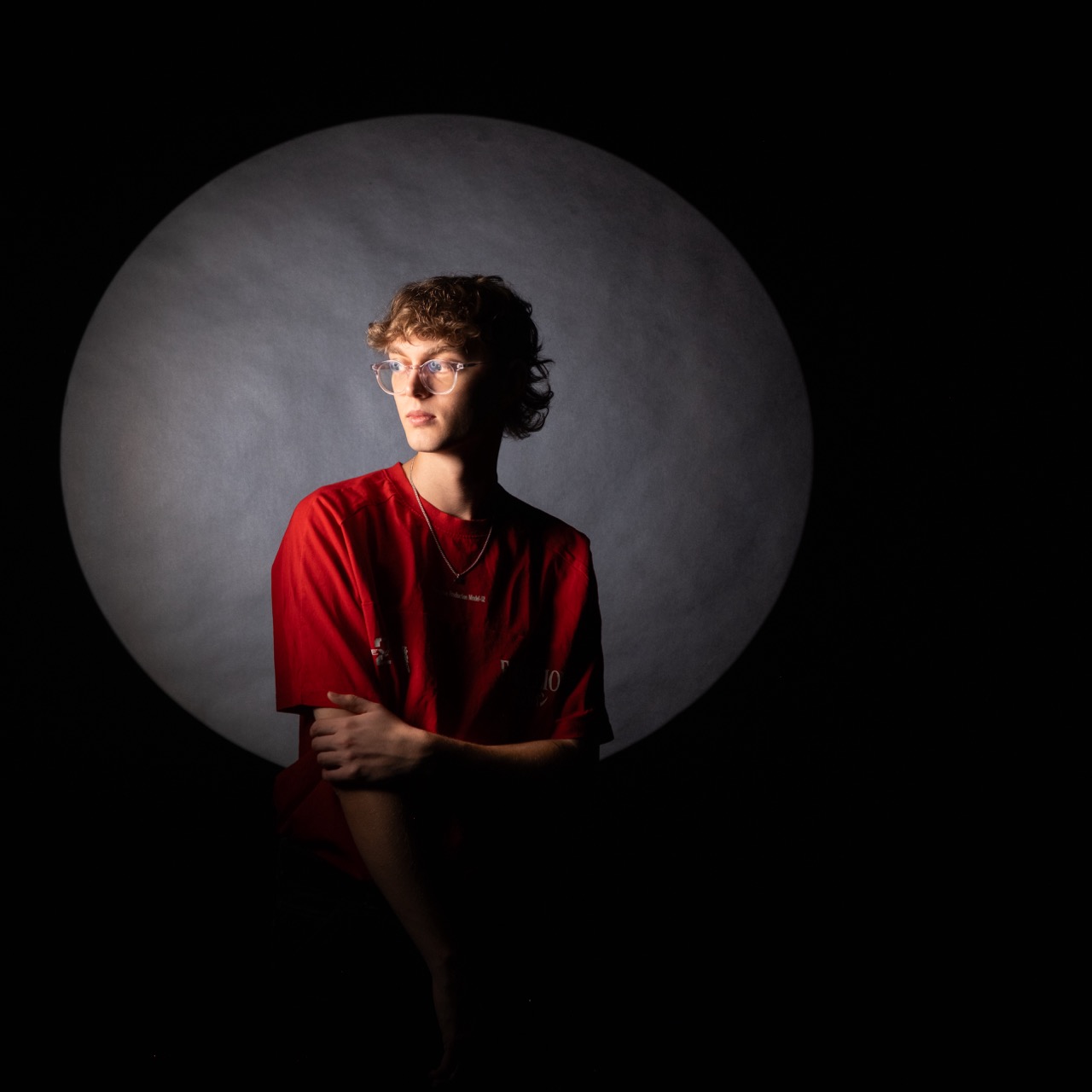
For this music video I did co-direction, a studio shoot, bts photos and cinematography.


For this music video I did co-direction, photos and camera work.
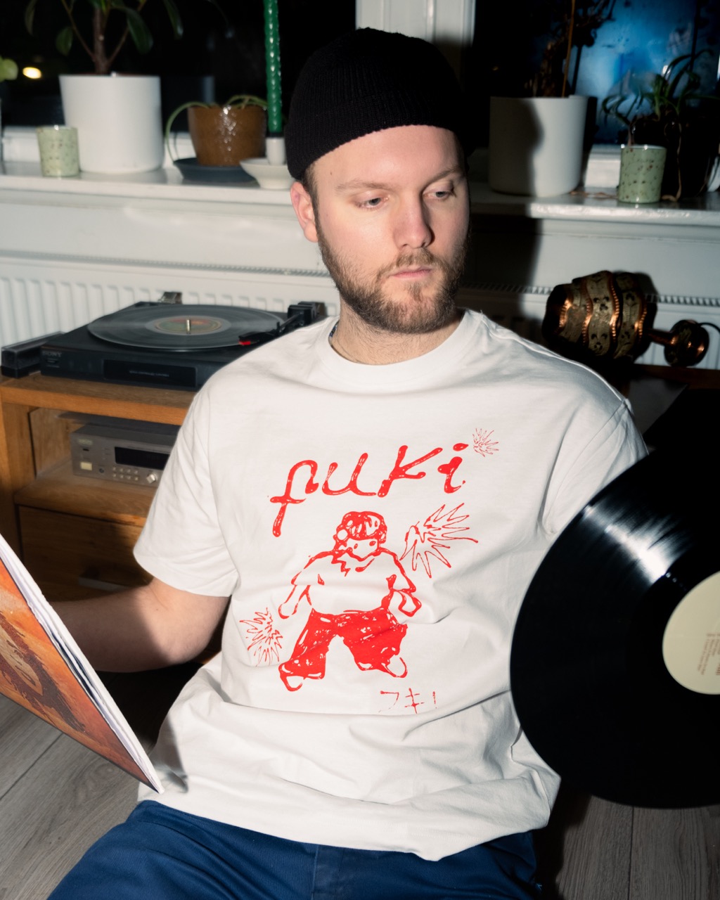
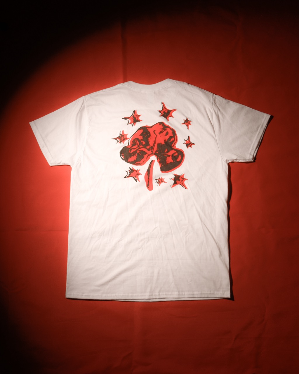
We made two merch collections. For the designs we wanted to experiment with unusual materials and give a specific feeling to our brand
The first collections was designed with Sriracha saus on paper.
The second collection was designed with Play-doh